{pantone fashion color report}: spring 2013
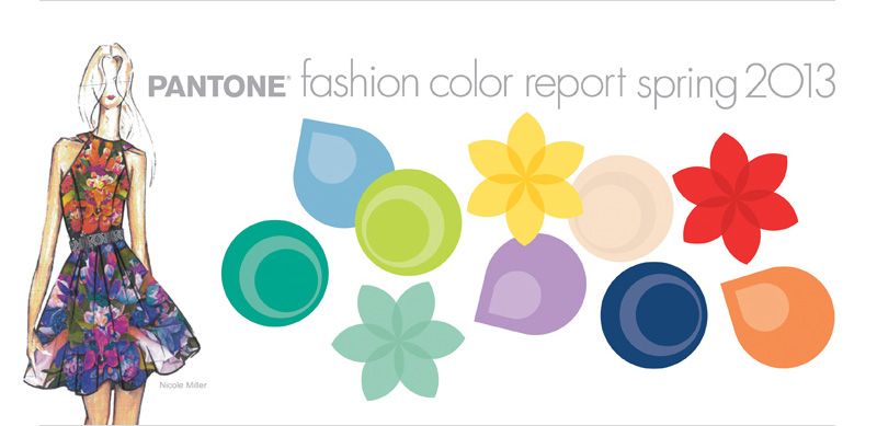
When you're a color fanatic like I am, it's only natural to feel a little excited when you see the Pantone Fashion Color Report for the upcoming season. And so that's why when I saw the report today I just knew I had to share it with you guys. Yep, that's right... PANTONE has unveiled their Fashion Color Report for Spring 2013! A comprehensive overview of designer's use of color in their upcoming collections, the report features 10 colors for women's and men's fashion for Spring 2013! And well, I could not be more thrilled to weigh in with my thoughts and opinions on their fabulous choices.
Plus I thought it would be the perfect time to share with you some of the wedding color palettes that I've personally created that feature these lovely PANTONE hues! This season, designers are interested in addressing consumer's desire for self expression, balance and the need to re-energize. With these needs in mind, PANTONE has chosen a palette that mixes dynamic brights with novel neutrals. This exciting mix of colors allows for unique combinations that offer both practicality and versitality. What does that mean for the wedding industry? Keep reading to hear my thoughts.
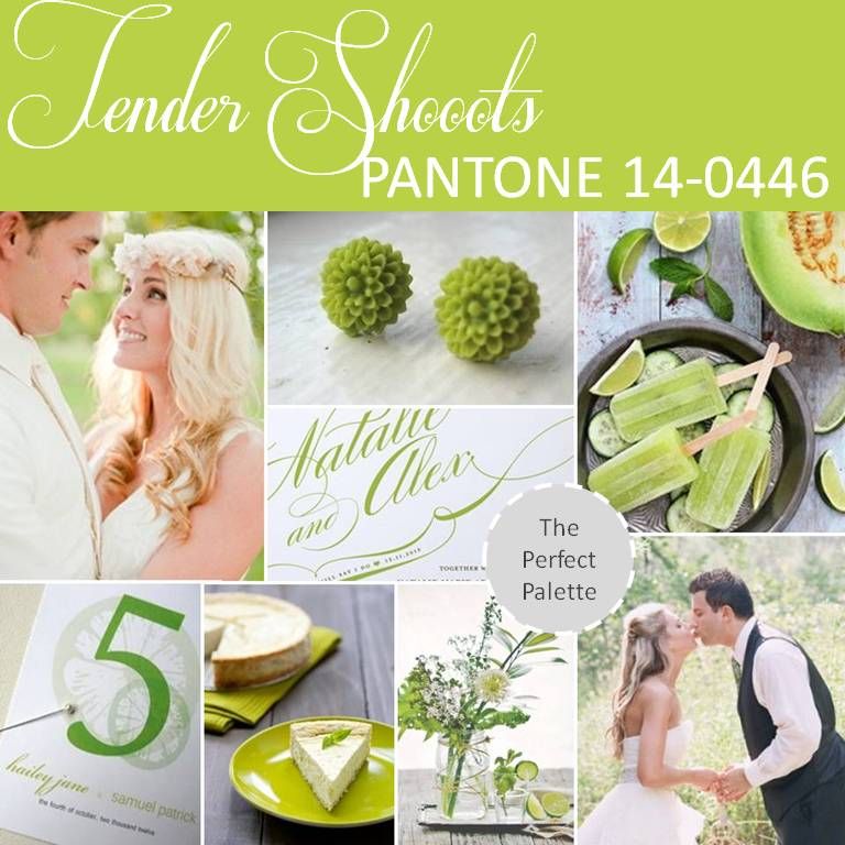
{top row}: newlyweds in love, earrings, margarita popsicles{middle row}: gorgeous invitation by Minted{bottom row}: table numbers, food presentation, centerpiece, love.
The presence of green this Spring is sure undeniable! Like the first signs of Spring, Tender Shoots, a vibrant yellow-green, is energized, cheerful and full of vibrant undertones. I think brides will love this color because it communicates a sense of happiness and liveliness.
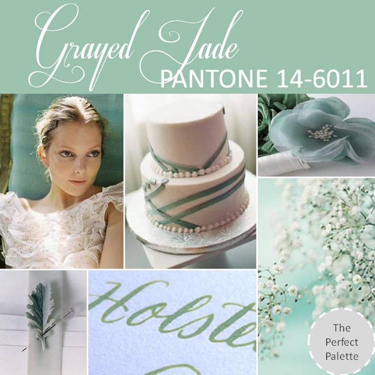
{top row}: lovely bridal portrait, fondant wedding cake, flowers,{bottom row}: floral, calligraphy, baby's breath.
While Grayed Jade offers a subtle approach with it's hushed gray undertones... It has a softness and quietness about it that makes it easy for it to communicate romance and elegance. Differing in their intensity, I think brides will be attracted to each of these greens for different reasons depending on the mood their hoping to achieve.
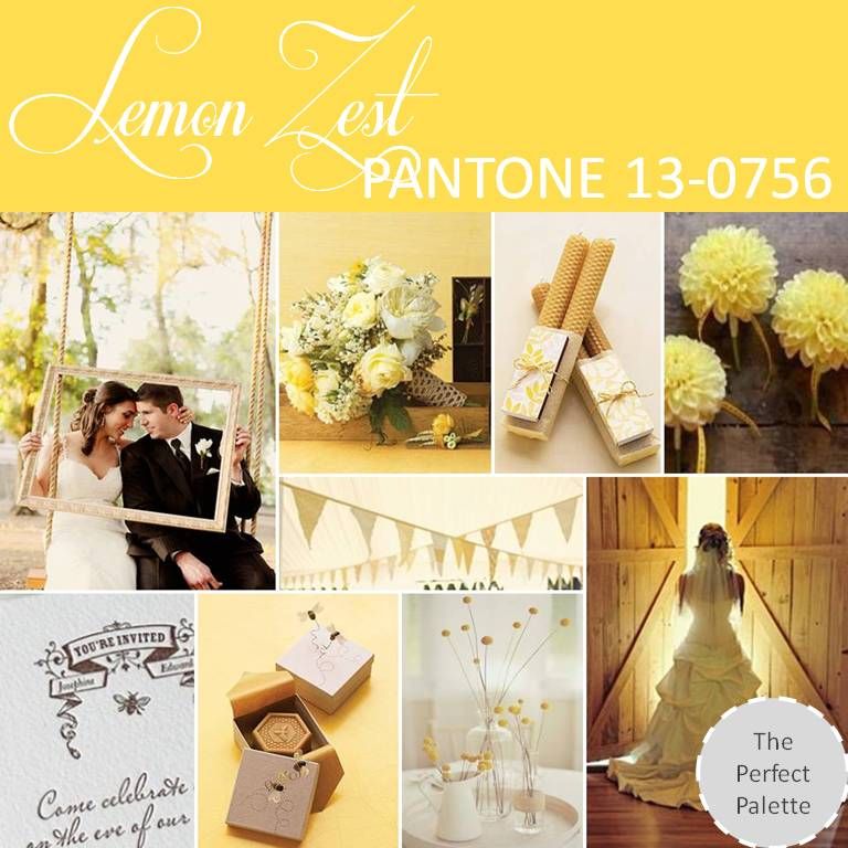
{top row}: newlyweds, lovely bouquet, beeswax candles, florals{middle row}: yellow bunting{bottom row}: invitation, soap favors, centerpiece, bride.
Lemon Zest is definitely a color that brides have long loved and this Spring will be no different. Cheerful yellows are definitely high on the list when it comes to party palettes. I love how this color has a way of communicating that ''kick your shoes off and dance'' kind of vibe. I suggest pairing Lemon Zest with more muted colors like soft browns or slate gray.
Lemon Zest is definitely a color that brides have long loved and this Spring will be no different. Cheerful yellows are definitely high on the list when it comes to party palettes. I love how this color has a way of communicating that ''kick your shoes off and dance'' kind of vibe. I suggest pairing Lemon Zest with more muted colors like soft browns or slate gray.
{top row}: striped skirt, boat, nautical invitation{middle row}: hand tied bouquet of anemones {bottom row}: lovely bouquet, cake, flatware idea, lemonade.
Monaco Blue is a color that I'm really loving and I'm so glad it made Pantone's list for Spring! Anchoring Monaco Blue is a classic shade that offers both depth and a richness to an entire palette. I personally love to see this color used in nautical themed weddings or even weddings near the ocean. Combine Monaco Blue with Dusk Blue to achieve more of a monochromatic look. Or consider mixing it with Grayed Jade for a palette that will surely wow!
{top row}: lovely bridal portrait, red earrings, cupcakes {middle row}: homemade raspberry pie {bottom row}: cupcake, bridesmaid dress, flatware, heels.
Poppy Red is the sort of color that is full of amazing energy. Seductive, sensual and surely celebratory, Poppy Red is definitely the sort of color that creates a powerful visual impact. Add a little red to your wedding day and you're sure to add a little pizzazz. Whether it's red lipstick or a fierce pair of red high heels... Poppy Red will surely turn heads.
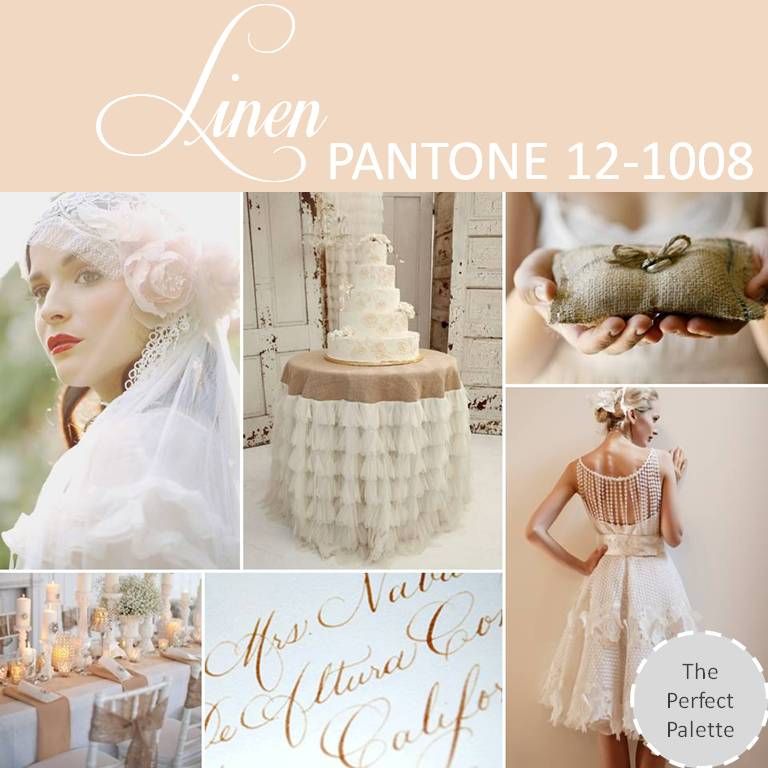
{top row}: bridal style, table skirt, burlap ring pillow via whichgoose,{bottom row}: tablescape by cedarwood weddings, calligraphy by laurahooper, francesca miranda bridal.
Linen on the other hand is the sort of color that is easy on the eyes. It's soft, it's subtle and Linen is surely the sort of warm neutral that we're seeing more often for weddings. I love the idea of incorporating burlap details or even lace. When it comes to wedding palettes, I suggest incorporating Linen into your palette to add a little warmth.
Linen on the other hand is the sort of color that is easy on the eyes. It's soft, it's subtle and Linen is surely the sort of warm neutral that we're seeing more often for weddings. I love the idea of incorporating burlap details or even lace. When it comes to wedding palettes, I suggest incorporating Linen into your palette to add a little warmth.
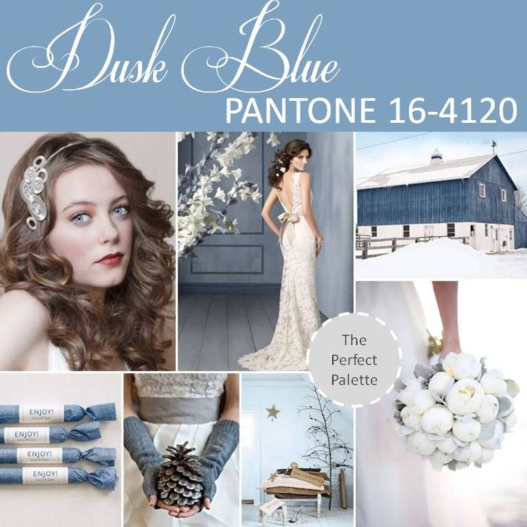
{top row}: hair piece by lucy marshall, dress by jim hjelm, winter barn,{bottom row}: wedding favors by martha stewart, pine cone, winter pretties, bouquet.
Signifying the time of day when everything starts to wind down, Dusk Blue offers a calming vibe that I just can't get enough of. Dusk Blue is very much like Grayed Jade in that it acts as this season's newest neutral in the Pantone palette. Although I love the idea of using this color for Spring, I have to admit that I'm loving it even more for Winter weddings!
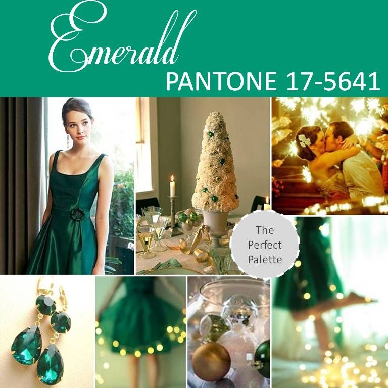
{top row}: bridesmaid dress, centerpiece idea via martha stewart, kisses,{bottom row}: earrings, green dress + lights, ornaments, dress.
Sophisticated Emerald is a lively and radiant rich green that is full of clarity. I love that Emerald green made the list for Spring because I think that it's the perfect shade to communicate all kinds of lovely ideas for the season. Definitely a color that I feel is underused in weddings, my hope is that brides will begin using this color more often. Again, it's also another shade that I think works for other seasons like Winter.
Sophisticated Emerald is a lively and radiant rich green that is full of clarity. I love that Emerald green made the list for Spring because I think that it's the perfect shade to communicate all kinds of lovely ideas for the season. Definitely a color that I feel is underused in weddings, my hope is that brides will begin using this color more often. Again, it's also another shade that I think works for other seasons like Winter.
{top row}: dress, lovely lace, barn,{middle row}: decadent desserts,{bottom row}: cupcakes, rustic mantel, pretty favors, bridesmaid dress.
Looking for a lovely shade of lavender for your upcoming wedding and/or party? Why not consider African Violet! This shade is surely one that effortlessly pairs with neutrals like brown and gray. I personally love that you can pair this color with so many different shades to create all kinds of unexpected pairings. Like Nectarine for instance...
{top row}: bridal hairstyle, orange lanterns, polka dot tie.{bottom row}: citrus inspired food, straws via bakersblingshop, orange shoes.
Nectarine is a bright citrusy shade that communicates a burst of energy that is unmatched. Celebratory in nature, this is the sort of color you just really can't take too seriously. And because of this reason, I just love Nectarine for Spring! Try pairing Nectarine shades like Lemon Zest or even Monaco Blue for an unexpected look. So what do you think of Pantone's top 10 choices for their 2013 Fashion Color Report? Are any of these colors catching your eye? Any favorites that you might consider using for your upcoming wedding or event? Still on the hunt for the perfect color? Be sure to check out all of our palettes here!






Social Links: