10 Wedding Color Palettes That Aren't Boring!
Looking for a pretty palette for your upcoming wedding or party? Tired of the same old color combinations? Hoping to find wedding colors that feel a bit unique? Not to fret, my loves. Because today I'm sharing 10 wedding color palettes that are far from boring! So let's get started!
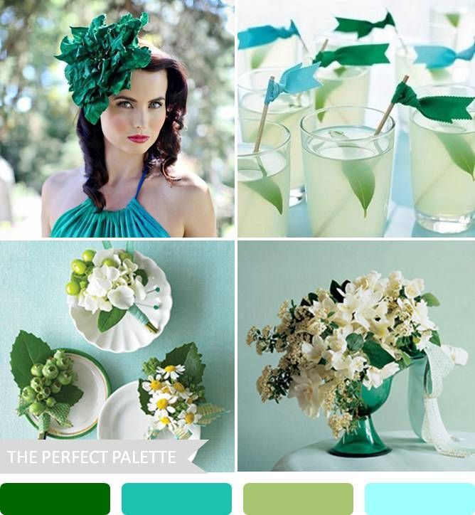
#1: AQUA + EMERALD
{emerald head piece | vela images by greta kenyon, drink flags | photo by johnny miller via martha stewart weddings, boutonnieres | photo by johnny miller via martha stewart weddings, centerpiece | photo by yunhee kim via martha stewart weddings}
What happens when emerald is paired with lovely shades of aqua and turquoise? Something pretty spectacular. That's what! Perfect for Summer or Spring, this pretty palette had me at hello. I'm loving all the variations in color. The brightness of the emerald has a way of instantly capturing the eye, while the softness of the aqua hues keeps this palette feeling sophisticated and sweet.
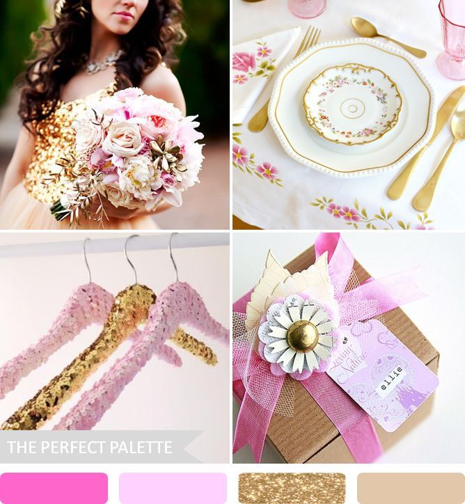
#2: PINK + SPARKLY GOLD
{beautiful bouquet | planning and event design by middle aisle wedding design & planning, floral design by bloomers floral, photo by ak studio design, via wedding chicks, gorgeous wedding place setting | citrus & orange, sequin hangers | keep, pretty package | art as life}
My obsession with sweet sparkles continues with this lovely little palette of pink of gold. Because I can't think of a more fun and festive way to say 'i do' than with a dazzling dose of sparkle! I don't know about you, but glittery gold sequins really do have a way of inspiring me. Want to add a touch of pizzazz to your party? These colors will surely do the trick!
#3: YELLOW + GRAY
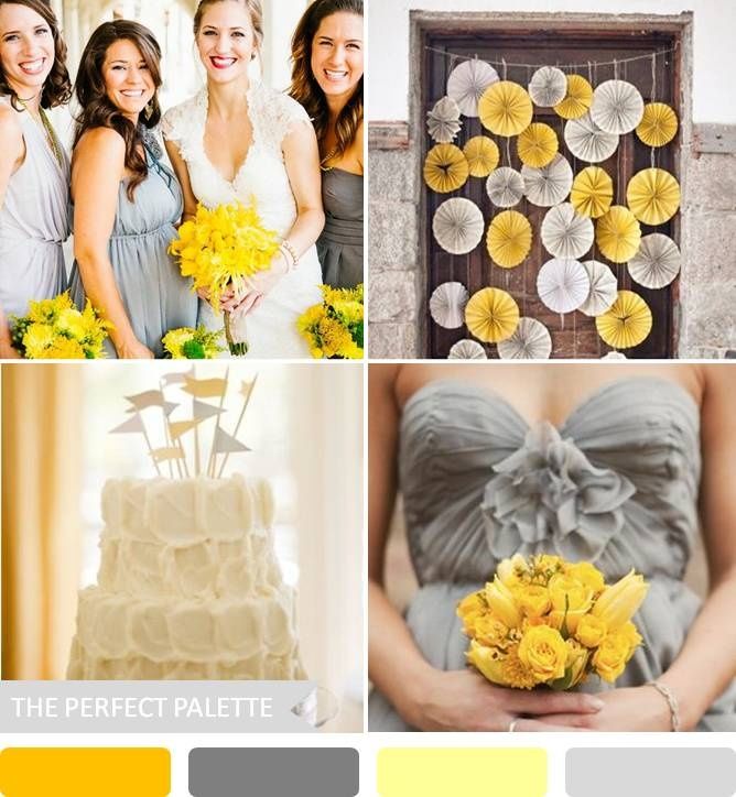 {bridesmaid dresses | kayla adams photography via ruffled, pinwheel decor | photography by ampersandphoto via style me pretty, cake with flag toppers | spindle photography via elizabeth anne designs, bridesmaid dress + bouquet | stephanie williams photography}
Let's face it, these wedding colors aren't your grandma's wedding colors. They're surely a scheme dreamed up by a new generation. Couples who love to embrace uniqueness flock to colors like these. And it's easy to see why! If you're looking to add a healthy dose of whimsy and fun to your day, then you might consider something fun & festive like this!
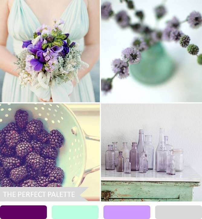
#4: MINT + LAVENDER
{bridesmaid bouquet | angela higgins photography, floral idea | lupengrainne | blackberries | weddings by lilly | vintage bottles | dreamy whites}
I don't think it's any secret that I'm absolutely in smitten with the color mint! And for many reasons. But have you ever considered pairing it with shades of lavender and plum? I just love how these colors come across as soft and airy. But it's also great how you can increase the intensity here and there by adding a pop of deeper color! So far from boring. Am I right?
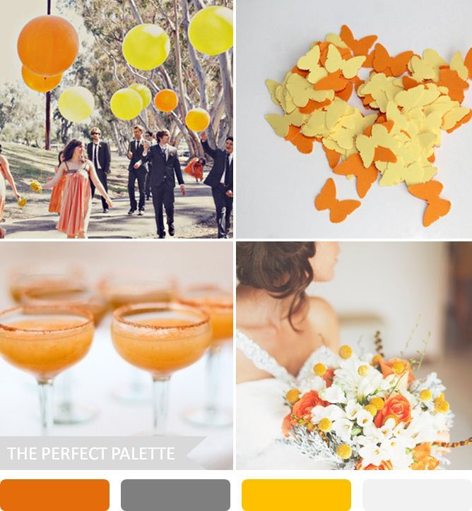
#5: ORANGE + YELLOW
{bright balloons | priscilla valentina via green wedding shoes, butterfly confetti | stitchedtoatea, signature cocktails | photo by aaron delesie | beautiful bouquet | photo by teneil kable via style me pretty}
Next up on my 'far from boring' list is this sunshine filled palette of orange and yellow! Celebratory, lively and full of fun, these are the sort of colors that inspire me. Mix in some sweet gray tones and you'll surely have a palette that is 'party ready!'
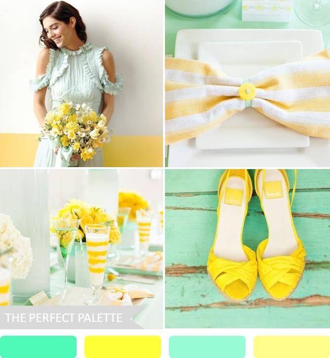
#6: MINT + YELLOW
{pretty bridesmaid | martha stewart weddings, striped napkin | matt wittmeyer photography, planning by bella and co, tablescape | matt wittmeyer photography, florals by sassafras flowers, planning by bella and co, yellow shoes | mirelle carmichael photography via style me pretty}
Next up we have one of my all time favorite pairings. In my opinion, mint and yellow are the perfect compliment to one another. Sweet, playful and definitely fun-filled, this happy palette makes me want to pour myself a nice tall glass of lemonade. Absolutely unique and far from being boring, this pretty palette had me at hello.
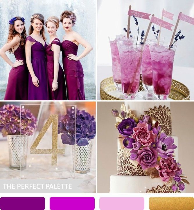
#7: PURPLE + SPARKLY GOLD
{jlm couture and twobirds at miss bush bridalwear via lovemydress | photo by eddie judd photography, specialty drinks and flags, table number | photo by harwell photography via southern weddings, wedding cake | wild orchid baking company via brides}
Shades of purple really are pretty, wouldn't you agree? Mix in some fabulous metallics like this glittery gold shade and you've got what I like to call a ''perfect palette.'' I'm really liking the feel of this palette because I feel like it incorporates a touch of whimsy all while mixing both modern and vintage styles. So totally different (in a good way!)
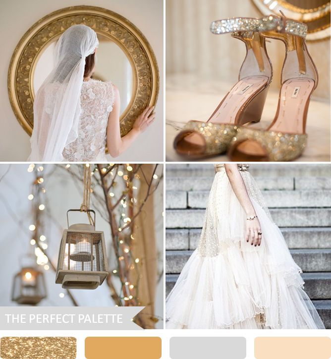
#8: SHADES OF SPARKLY GOLD
{mirror and bride | photo by elizabeth messina via kiss the groom, sparkly heels | photo by catherine farquharson, lanterns in the trees | photo by razvan photography via style me pretty, ida sjostedt polka dot gown}
Gold has a way of coming across as elegant and chic. And when it comes to selecting your wedding colors, I can't help but feel swept away by how dreamy this feels. To me, this just screams special. Because seriously, guys. There's not a lot in this world that can catch my eye quite like glittery gold.
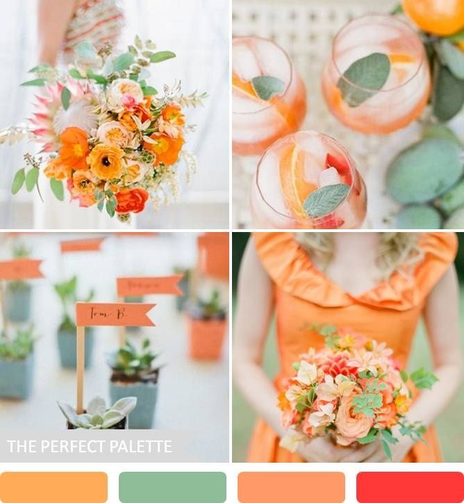
#9: ORANGE + SAGE
{bouquet | jose villa, guava sangria with sage | photography by jess wilcox via santa barbara chic, succulent escort cards | photography by abi q, design by joy events co via ruffled, orange bridesmaid dress with small bouquet | elisa b photography via ruffled}
I'm slightly smitten with all things orange! And I think it's pretty safe to say that my little love affair for this gorgeous hue is only growing. Because when paired with earthy greens and peach undertones something pretty special happens. It's the perfect blend of soft and subtle and bold and bright if you ask me. And if uniqueness is what you're after, this palette is surely that!
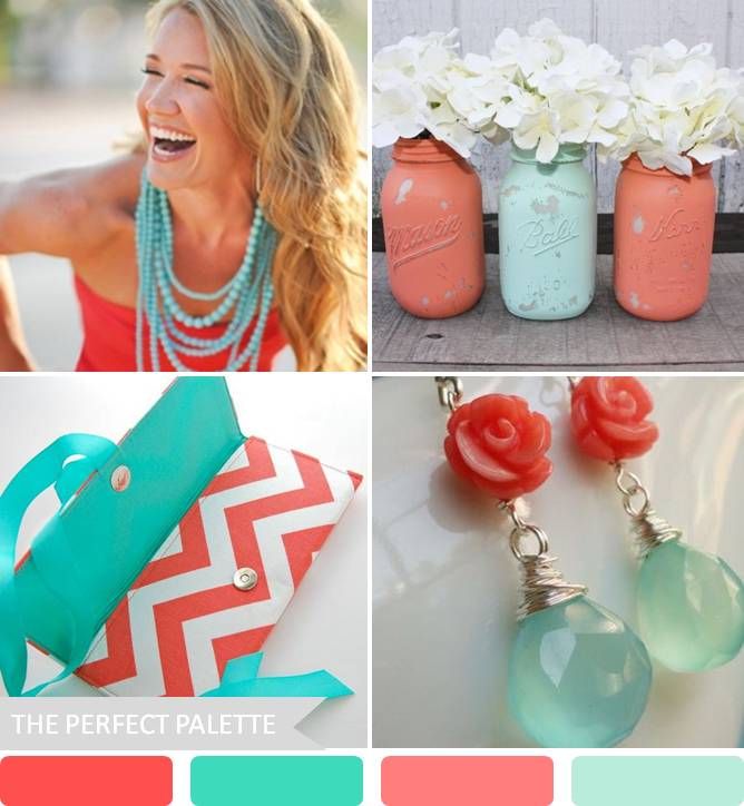
#10: CORAL + AQUA
{coral and aqua attire | jessica frey photography, painted mason jars | thespeckledegg2011, chevron clutch | ao3designs, earrings | briguysgirls}
Bright, bold and oh so beautiful, this is the sort of palette that grabs my attention and inspires me to think creatively. I like this because it's simply not a color palette you see every day. It's a bit unique and definitely a whole lot of fun.
So there you have it! You see, there are plenty of wedding color palettes that I consider far from boring. You just have to open yourself to the possibilities. Don't force yourself into using a color palette you don't absolutely love. Because, seriously. There are far too many unique and spectacular color schemes out there! Don't settle for boring, just because it feels ''safe.'' I urge you to embrace the beautiful, embrace the bold, and be a bit daring with your color choices. Don't be afraid to go for it! Believe me, you got this!
Still feeling a bit unsure about your color choices? Hop on over to the color palette library and start discovering the many, many ways you can use color to bring your wedding to life! Oh, and leave me a comment below and let me know which one of these palettes you are loving most?




Social Links: