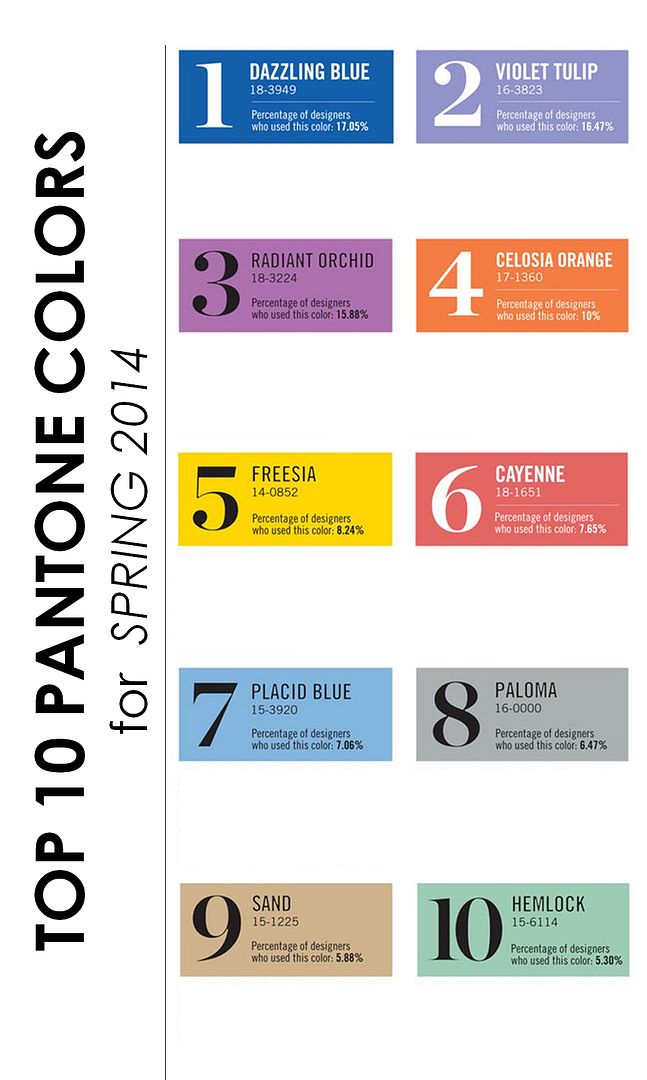
Top 10 Pantone Colors for Spring, 2014
Pantone recently unveiled their top 10 colors for Spring, 2014. And what a beautiful array of colors they chose! I swear, I'm always like a kid on Christmas morning when these lists come out. I mean, can you blame me? I live and breath color. And so naturally, I shared the list with you guys! Remember this post? Remember how I promised that we'd take a closer look at these lovely shades and delve into all the pretty possibilities? Well, today is the day. So let's get to it. Shall we?
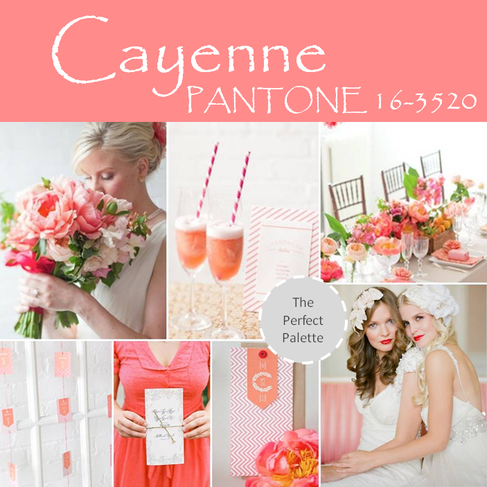
First up, we have this sweet shade that goes by the name, Cayenne. Perfect for a Spring wedding, I suggest pairing Cayenne with cool colors like Hemlock, a naturally fresh shade of mint, and you'll have a palette that captures both ends of the seasonal spectrum. Or why not keep things simple and pair it with white like I've done here?
{lush bouquet | photo by rebecca wood, specialty drinks | photo by rebecca wood, table setting | photo by rebecca wood,escort card display, invitation suite, lovely paper, pretty brides | photo by alicia swedenborg via wedding chicks}
Next up on next year's ''it'' color list for Spring is this spicy shade of orange that Pantone is calling Celosia Orange! Praised for it's intensity, I'm loving this energetic color and I hope you can see why! I suggest pairing fiery hues like this with understated neutrals. And I'm especially loving the way it looks with gray tones.
Next up on next year's ''it'' color list for Spring is this spicy shade of orange that Pantone is calling Celosia Orange! Praised for it's intensity, I'm loving this energetic color and I hope you can see why! I suggest pairing fiery hues like this with understated neutrals. And I'm especially loving the way it looks with gray tones.
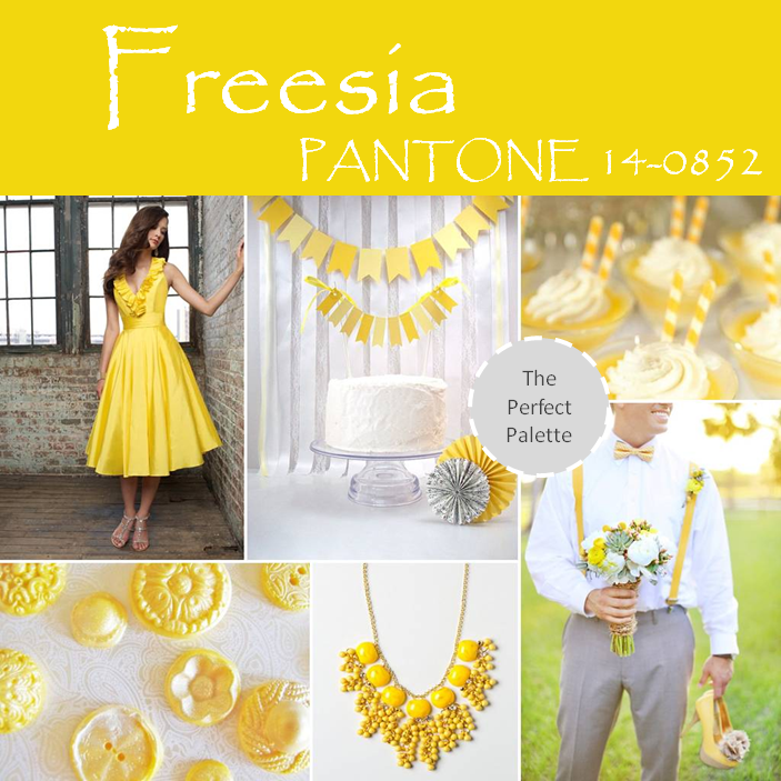
Looking for a color that will pop in a good way? This happy, sunshine-filled color is all that and then some. Incorporate Freesia into your wedding day colors and you're sure to create a fun atmosphere full of feel good vibes. I suggest pairing Freesia with soft gray tones or classic white.
{bridesmaids dress by mori lee style 20205, cake topper via beebuzzpaperie, drinks via the wedding chicks, chocolate buttons by thefrostedpetticoat, necklace by lemon zest confetti necklace via anthropologie, groom via wings of glory photography}
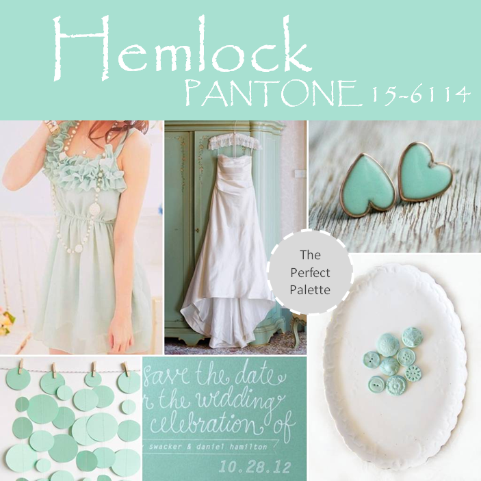
It's no wonder why this shade made Pantone's top color list! Minty shades like Hemlock have been topping the wedding color charts all year! And I'm hoping you can see why? I suggest keeping things simple and pairing shades like mint with white or gray tones.
It's no wonder why this shade made Pantone's top color list! Minty shades like Hemlock have been topping the wedding color charts all year! And I'm hoping you can see why? I suggest keeping things simple and pairing shades like mint with white or gray tones.
{lovely dress, bridal gown by corbin gurkin via style me pretty, earrings, garland, save the date by designbybittersweet, chocolate by the frosted petticoat}
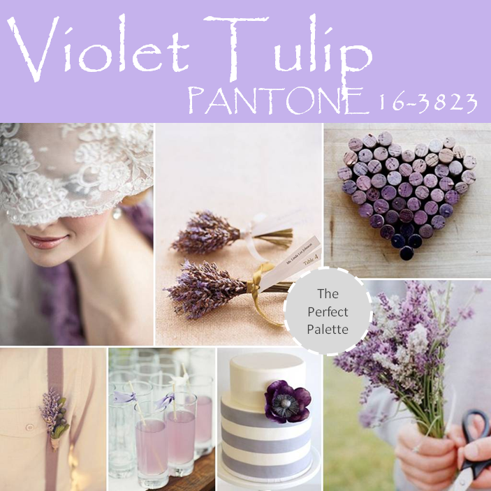
Have a passion for all things purple? Well, you're in luck because Pantone made sure to incude two shades of purple in next Spring's lineup! First up, we have Violet Tulip. Romantic, elegant, and oh-so sweet, I suggest pairing this beautiful shade of purple with antique gold tones, or calming Placid Blue for an unique and unexpected look.
{vintage veil, lavender escort display, cork heart, photo by three nails, lavender lemonade, cake, DIY bouquet}
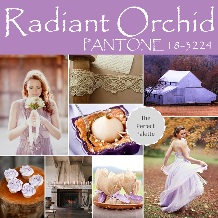
Love purple tones but looking for something a bit richer? I suggest considering a shade like Radiant Orchid! It's just a touch darker than Violet Tulip, and for that reason it makes it a great color to use when you're trying to go a bit more elegant with your event styling!
{dress, lovely lace, barn, decadent desserts, cupcakes, rustic mantel, pretty favors, bridesmaid dress}
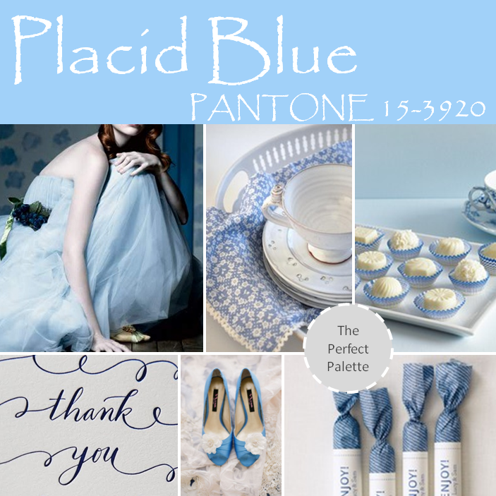
Placid Blue made Pantone's list. And I'm definitely agree with this choice. Blue is such a gorgeous color. Especially in weddings. And this light and sultry shade really communicates all sorts of great things. Calming, peaceful, and oh-so serene, Placid Blue is definitely one of my favorites on this list!
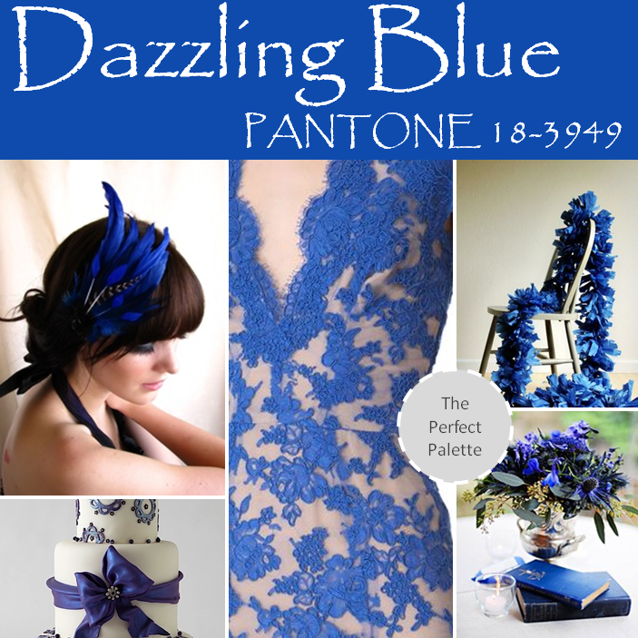
Looking for a more saturated blue? I suggest none other than Pantone's top color for Spring, 2014! Dazzling Blue! It's nothing short of...well, dazzling. Just one look and it's easy to see that this color is full of richness and beauty. Plus it's just the sort of color perfect for all you blue lovers out there.
{blue feather headpiece | eeekdesigns, blue lace dress | shopbop, blue accented cake | brides, gorgeous garlands | oh happy day, centerpiece | }
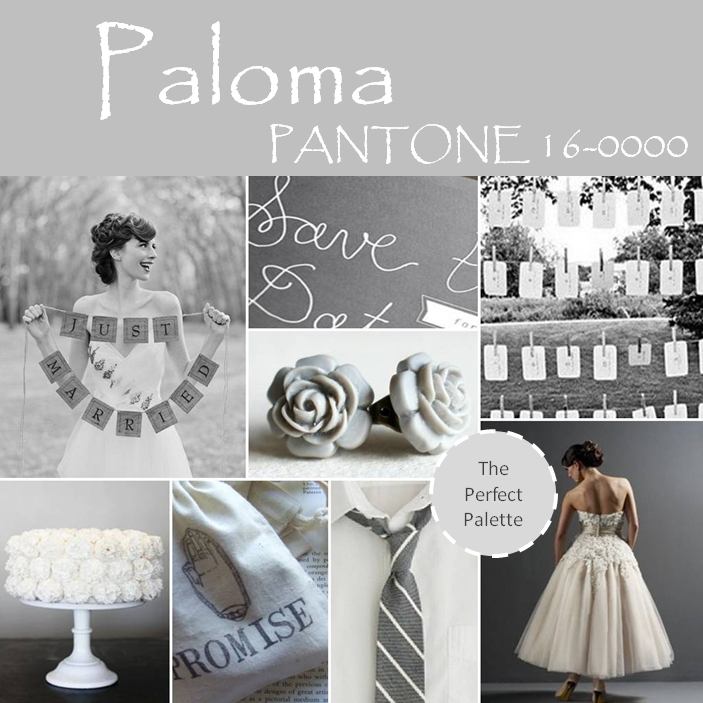
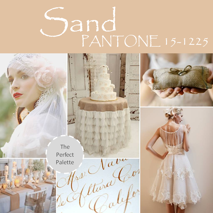
Rounding out Spring's cornerstone colors, Paloma, a soft mercurial gray, and Sand, a natural, earthy beige, provide more interesting and sophisticated alternatives to the black basics usually used in weddings.
{'just married' sign | elizabeth messina via kiss the groom, save the date detail | designbybittersweet, escort cards via once wed, rosebud earrings | danimakes, wedding cake | my sweet and saucy, promise bags | palomas nest, striped tie | j.crew, gorgeous gown | justin alexander bridal}
Both staple neutrals pair effortlessly with more expressive colors within the palette, such as Cayenne and Celosia Orange. Or why not pair these beautiful neutrals with a simple white or ivory for a more monochromatic look?
{bridal style, table skirt, burlap ring pillow via whichgoose, tablescape by cedarwood weddings, calligraphy by laurahooper, francesca miranda bridal}
Goodness. That was a seriously parade of pretty. Am I right? I don't know how you feel, but for me, all it takes is one look at these colors and it's plain to see that there is no shortage of creative ideas using these colors. So I have one question for you guys. And I'm excited to see your answers. The question of the day is, if you had to choose one of these shades as the primary color for your wedding, which color would it be and why?
My answer? Hemlock would probably have to get my vote (today at least, ask me tomorrow and I bet I would have a different answer!) And the reason why is simple. This minty shade has absolutely captured my heart. It has such a fun vibe associated with it and the possibilities for styling are endless! But I have to admit that Cayenne and Sand are two very close contenders as well.





Social Links: