By
The Perfect Palette -
May 22, 2014
-
When it comes to floral design, there's plenty of pretty ideas to choose from! From the bright and the beautiful to the soft and sweet, I always find myself drawing color inspiration from the prettiest of blooms! And so today I thought I'd share with you a few of my favorites! Get ready for some fabulous floral designs, color lovers!
1. A Bright Palette: First up on my list is this beautiful mix of bright shades. Talk about an instant pick me up. And these flowers? Aren't these just the prettiest? I'm loving the asymmetrical composition and I can't go without mentioning my love for this bold runner.
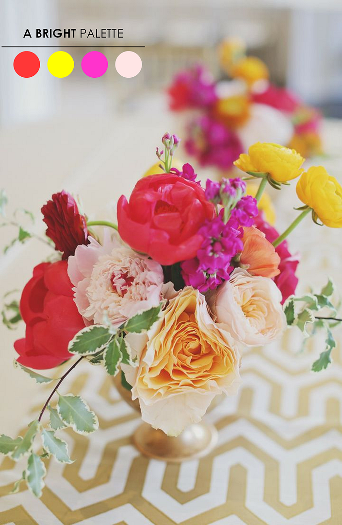 Forever Photography Studio via Style Me Pretty
2. Shades of Blue + Yellow: Dusty blue and golden yellow were just made to go hand in hand. I really like how this florist mixed various blooms to create this very unique look. The low profile makes it easy to carry on a conversation across the table with other guests, while the overall look is kept elegant and sophisticated.
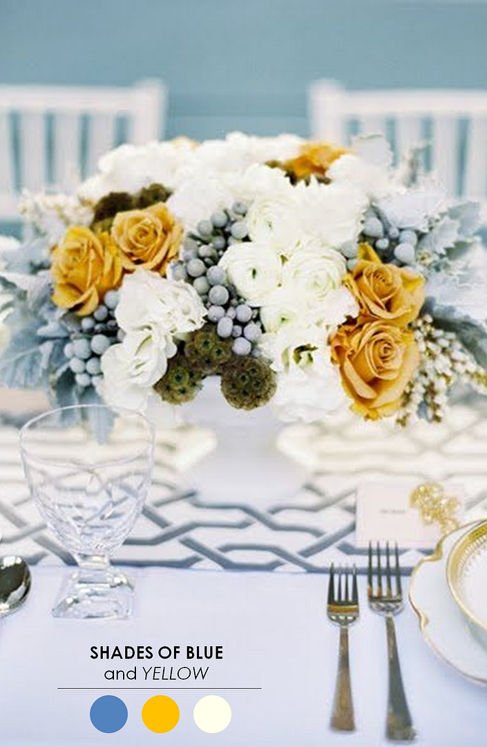 Floral Design by JL Designs
3. Shades of Pink + Yellow: This mix of pink and yellow really is the sort of palette that has me totally wishing it were Summer already. It's vibrant, it's exciting, and well, I can't help but gawk. I really do like the overall asymmetrical feel and those cute little billy balls had me at hello.
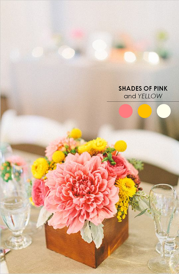 Photo by The Why We Love Floral Design by Bash Please via Wedding Chicks
4. A Lavender Palette: This centerpiece feels so charming to me. And for that reason alone, I'm really feeling really drawn to this look. It also doesn't hurt that this florist has mixed blooms in varying shades of lavender. What a sweet and romantic color palette. Bonus? A milk vase takes this look to a whole new level of awesomeness!
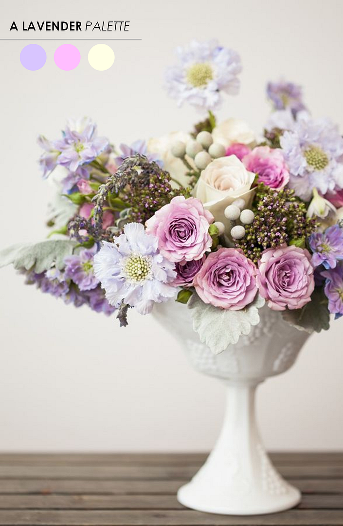 Photo by Charlie Juliet via Ruffled
5. A Pink Palette: These pretty pink centerpieces feel so romantic to me. And for that reason alone, I'm totally in love! It also doesn't hurt that this florist has mixed these blooms in such a way that feels very organic and natural. What a beautiful palette. Bonus? These gorgeous glass vases sure do add to the overall look! And could totally be used again way after your wedding day is over!
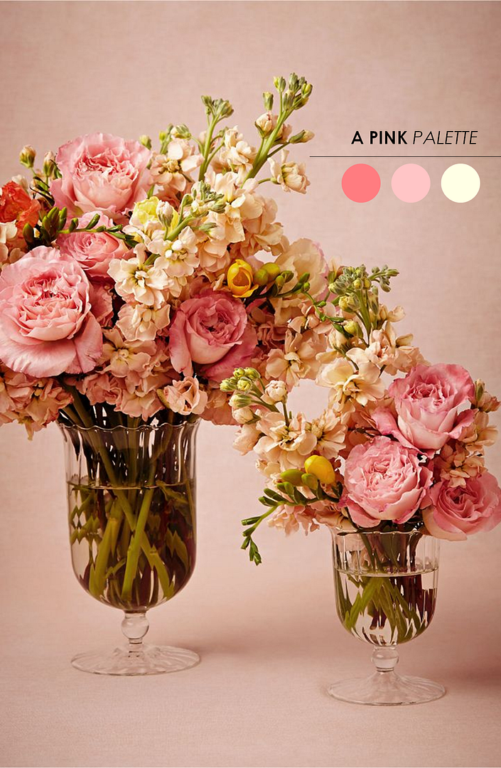 vases via BHLDN
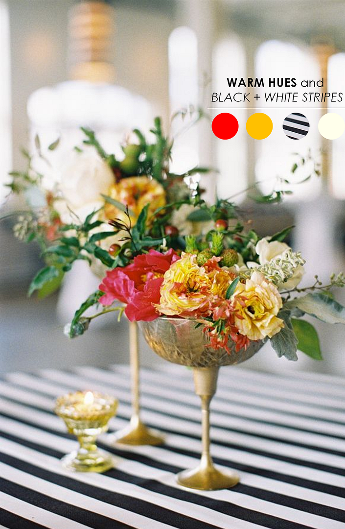
6. Warm Hues and Black + White Stripes: Okay, so I'm pretty sure that I've made my love for black and white stripes evident? Just one look at my Pinterest feed, and you'll see that I can't go long without pinning something with stripes! I'll admit it, I'm a total sucker for this look! And here's another pretty example of this look in action. I love how this florist paired bright and cheery blooms with this bold striped tablecloth. And those antique gold vases? Isn't the contrast just beautiful?
Floral Design by Fern Studio Photo by Landon Jacob Productions via Southern Weddings
7. Pink + Green: Shades of pink and green really work well together. Wouldn't you agree? I'm loving this centerpiece for many reasons, but mostly I'm loving the mix of ideas here. A charming hand painted table number looks really beautiful next to a low profile vase full of bloom. I also really like how simple this is.
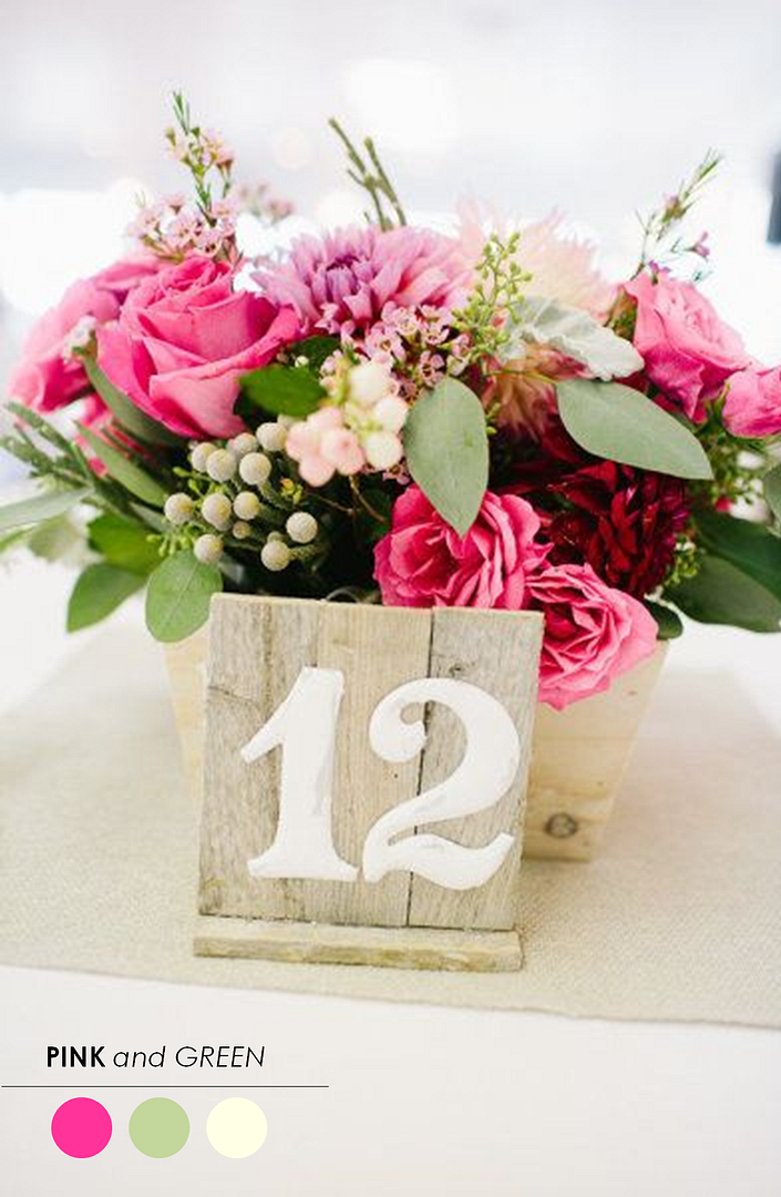 via The Paper Walrus
8. A Cheerful Palette: A great color palette to use for Summer or Spring really has to be this cheerful mix of coral, orange, and yellow. It's a color palette that I can't help but love and one that I'll always be fond of. And those milk glass vases? Aren't these just the cutest?
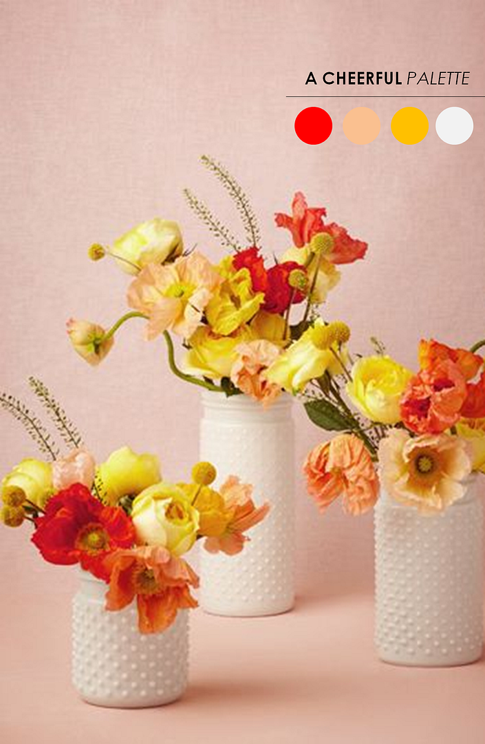 vases via BHLDN
9. Shades of Pink + Citrus: Okay, so remember when I said that I'm totally drawn to warm colors like pinks and oranges and yellows? Well, here's another impossibly pretty example of these shades in action. And that antique gold vase? Isn't the contrast just beautiful?
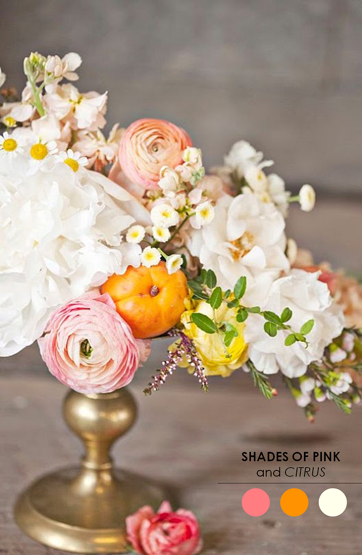 Photo by Our Labor of Love via The Bride's Guide
10. Shades of Mint + Peach: Mint and peach are the sort of colors that have a way of taking me somewhere dreamy. I really like how this florist mixed soft shades with these beautiful muted tones. The succulents add such an unexpected touch and the colors come across as elegant and romantic!
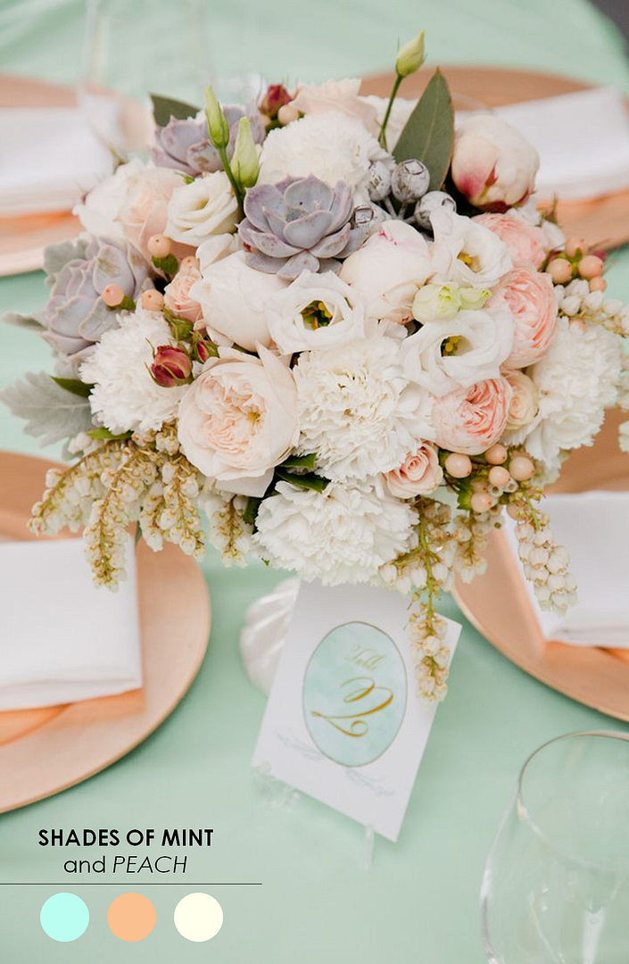 White Spark Photography Floral Design by Bouquets of Ascha Jolie via The Sweetest Occassion
So there you have it! 10 color inspiring centerpieces! So I have to ask...which of these centerpieces is your favorite? And what about it makes it most attractive to you? I can't wait to hear your responses! Want to see more ideas similar to these? Don't miss this post! I promise you there's plenty of pretty ideas to be seen!
Share This:
Chrissy Arpie Ott
Chrissy Arpie Ott is the founder of The Perfect Palette. Since its launch in 2008, The Perfect Palette has been the go-to color resource for couples who dream of a unique, creative and colorful wedding day.




Social Links: