Pantone Color of the Year: Rose Quartz and Serenity
Captured beautifully by B. Jones Photography, and with event planning by Bright & Co., hold onto your pastel-loving hearts because today's ballet inspired shoot shines the spotlight on this year's hottest colors!
From the designer, "When I first laid eyes upon “Serenity” and “Rose Quartz”, the dual Pantone Color of the Year for 2016, what immediately struck me was the soft, dreamy, and playful nature of both colors and how they complemented each other so beautifully.
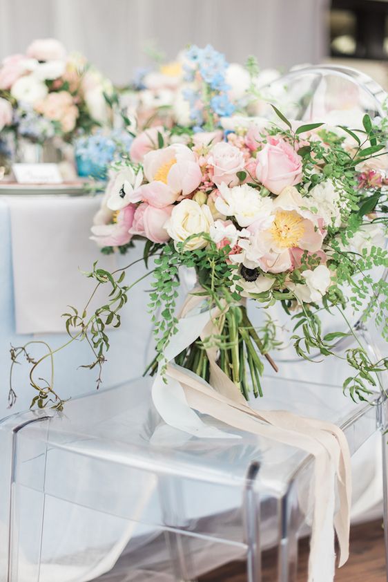
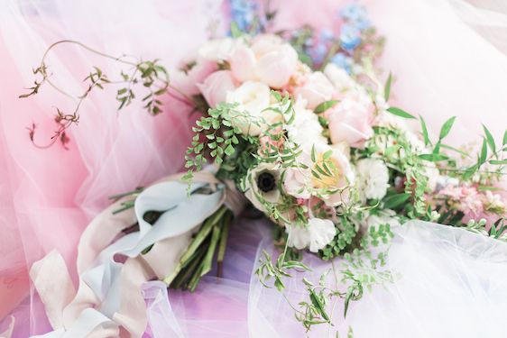
And so with this romantic theme in mind, this dream team of West Coast event pros made wedding magic happen! Amy of Gather was able to encapsulate motion in her floaty, hanging, and free moving florals....
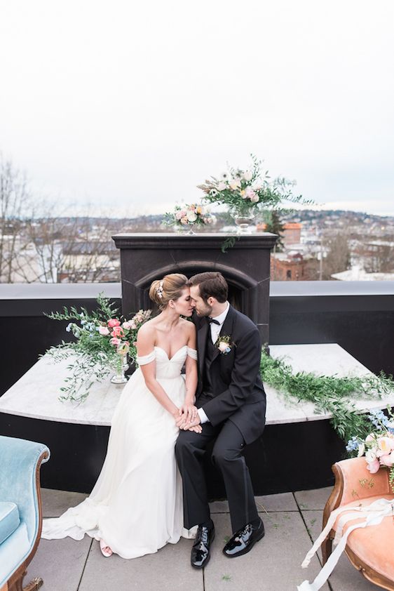
More from the designer, "Being a dancer myself I was immediately reminded of that same airy nature in ballet..."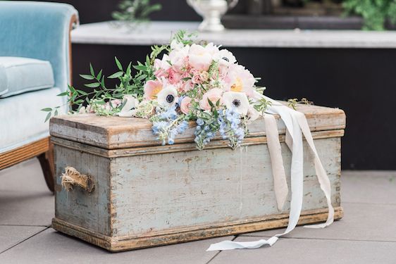
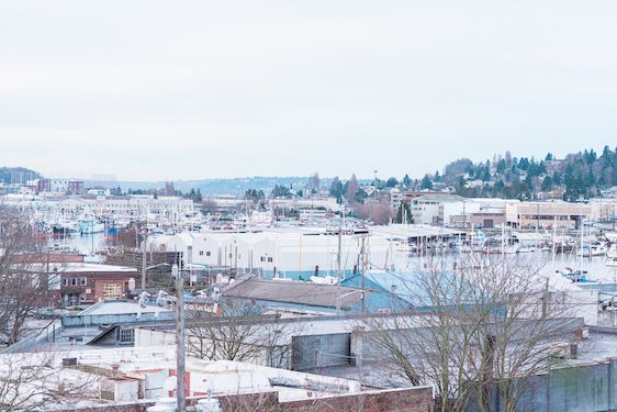
"...I wanted there to be a sense of fluidity and movement in everything for this shoot..."
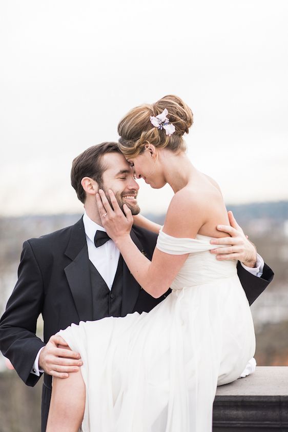
"... and the classically modern backdrop of the Olympic Rooftop Pavillion provided a perfect canvas to bring that vision to life..."
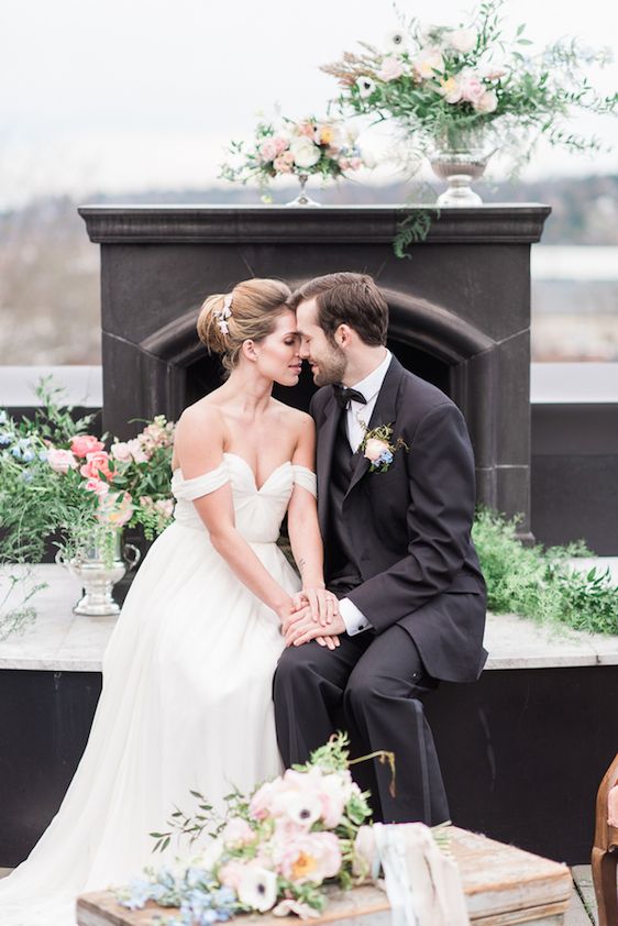
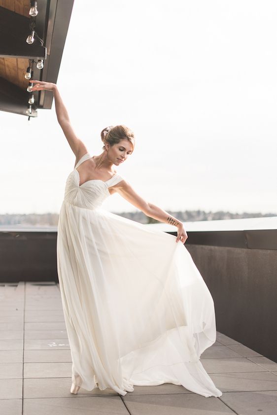
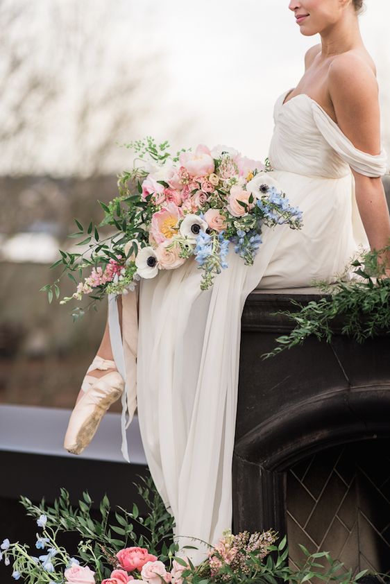
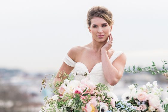
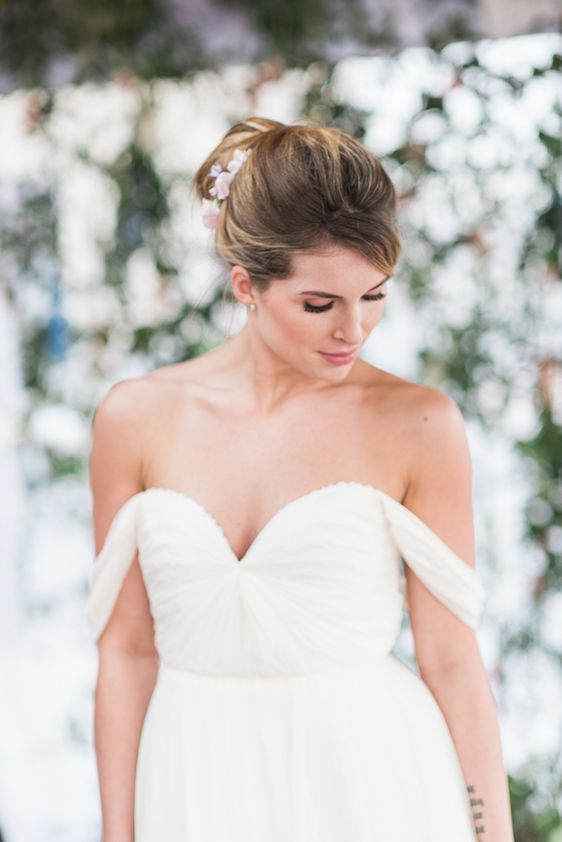
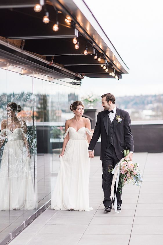
Their breezy open air patio gave the Sarah Seven gown from The Dress Theory the most ideal flowy and fluttery feel....
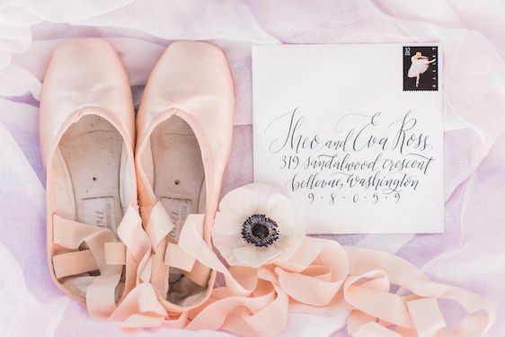
...while the highlight of this shoot definitely has to be the fact that their beautiful bride just so happened to be trained in ballet and brought along her pointe shoes to play!
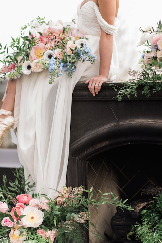
More from the design team, "Having the opportunity to watch her move in her gown was a thing of beauty..."
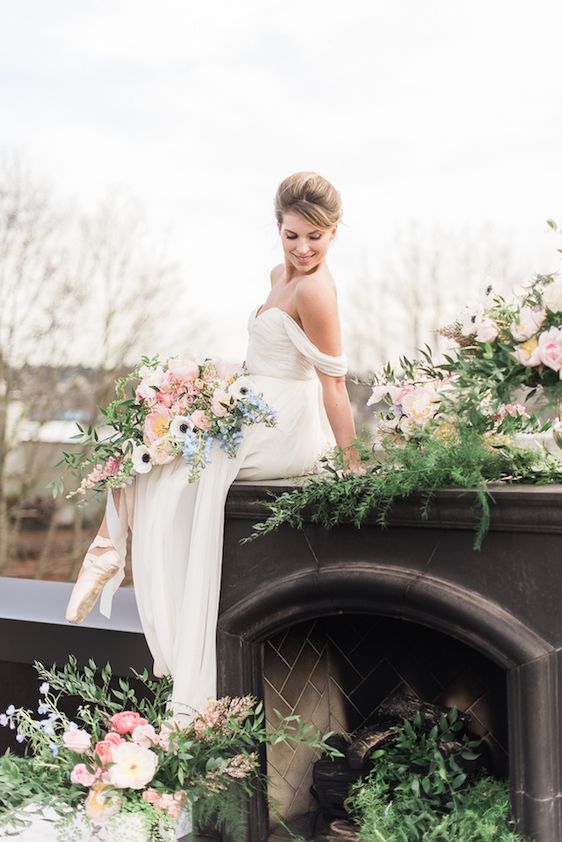
"...and it brought the perfect amount of elegance and weightlessness to an already dreamy scene."
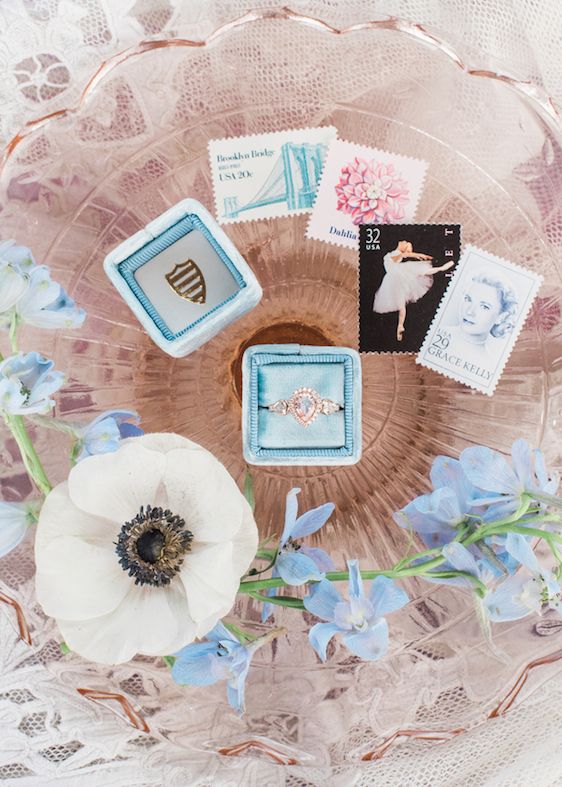
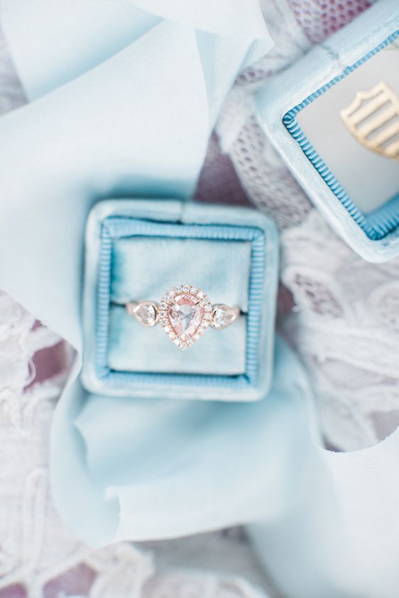
Vintage inspired ring boxes by The Mrs. Box added the prettiest pops of color...
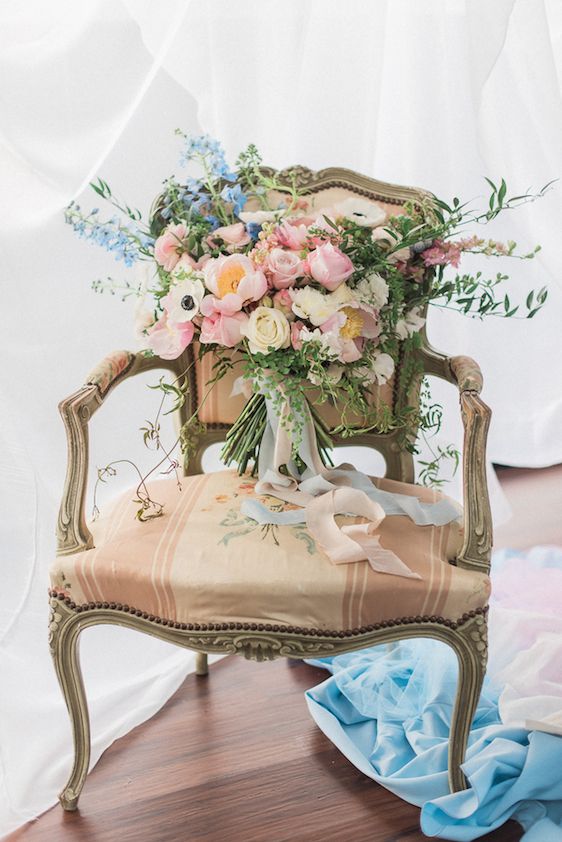
Oh, and can we just talk about these gorgeous silk ribbons by Silk & Willow?
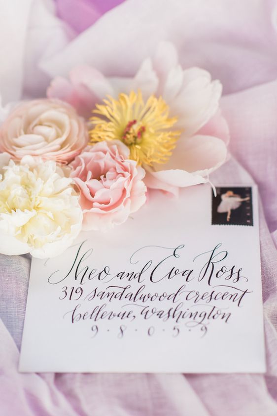
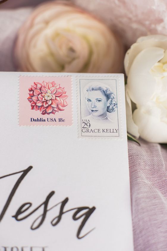
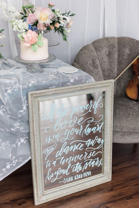
Calligraphy by Cable Car Couture added an unexpected romantic touch...
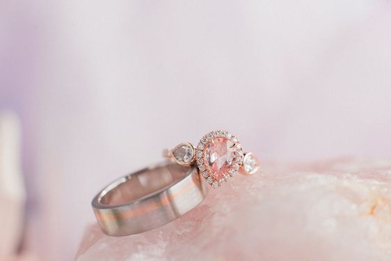
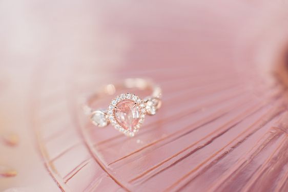
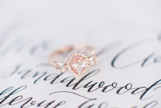
...and this dreamy, blush sparkler from Green Lake Jewelry Works? love, love, love!
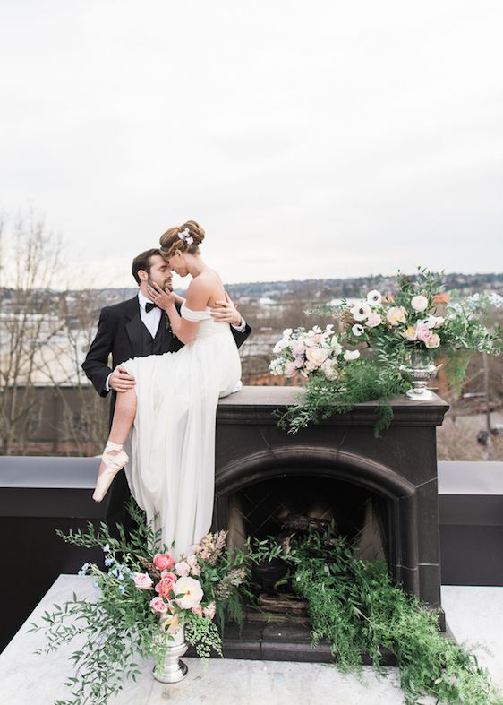
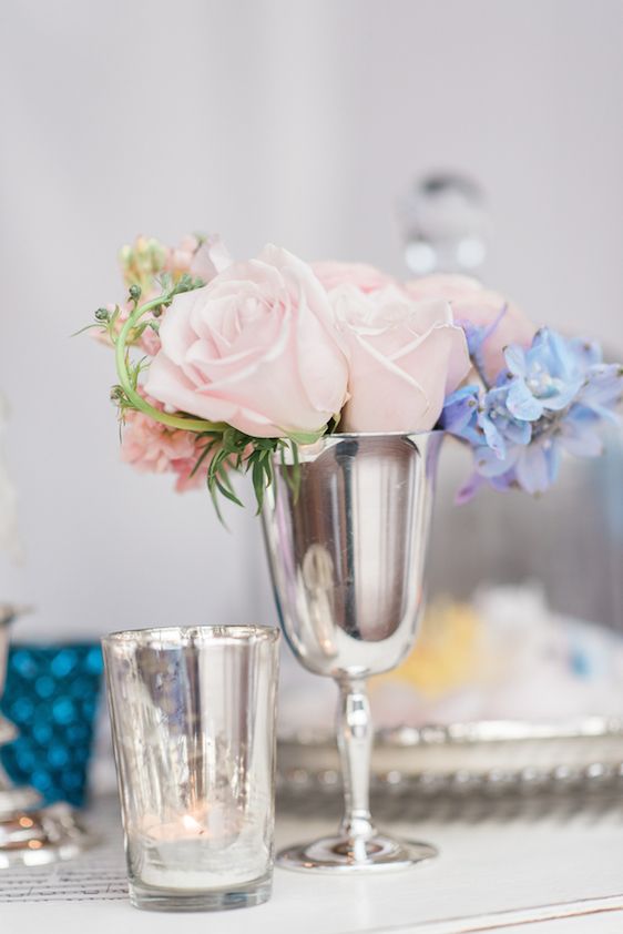
Romantic and all kinds of sweet — such a lovely example of dreamy done right!
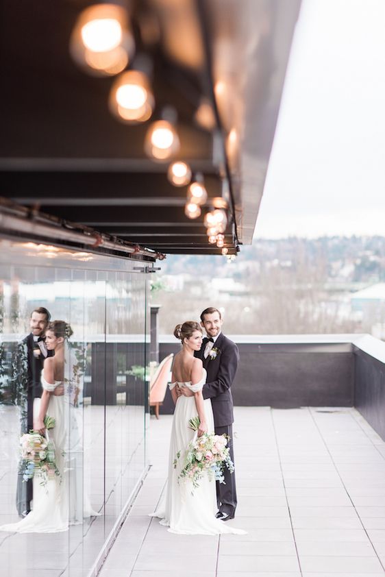
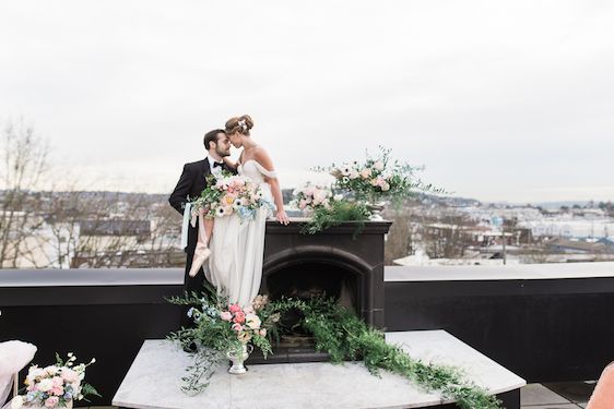
Such a twirl-worthy gown and just look at this gorgeous capture!
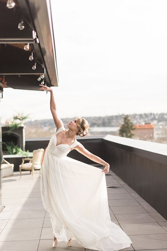
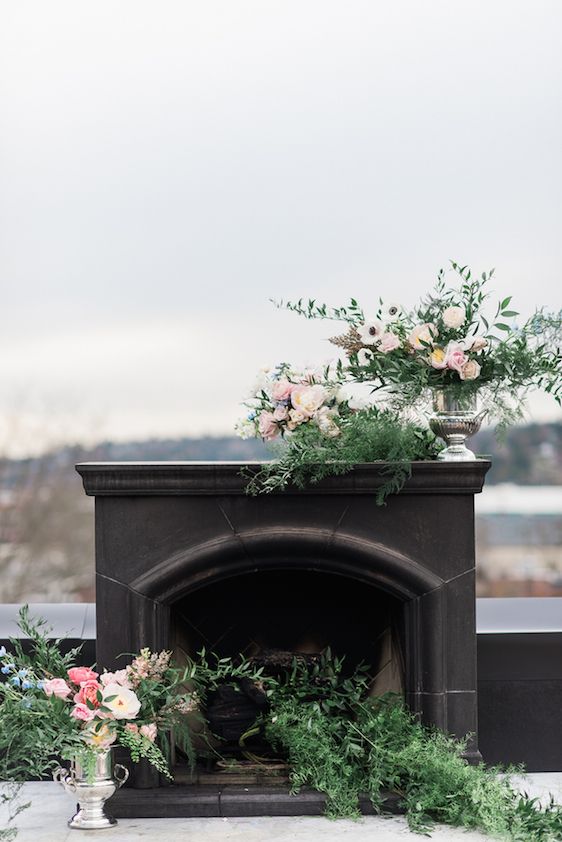
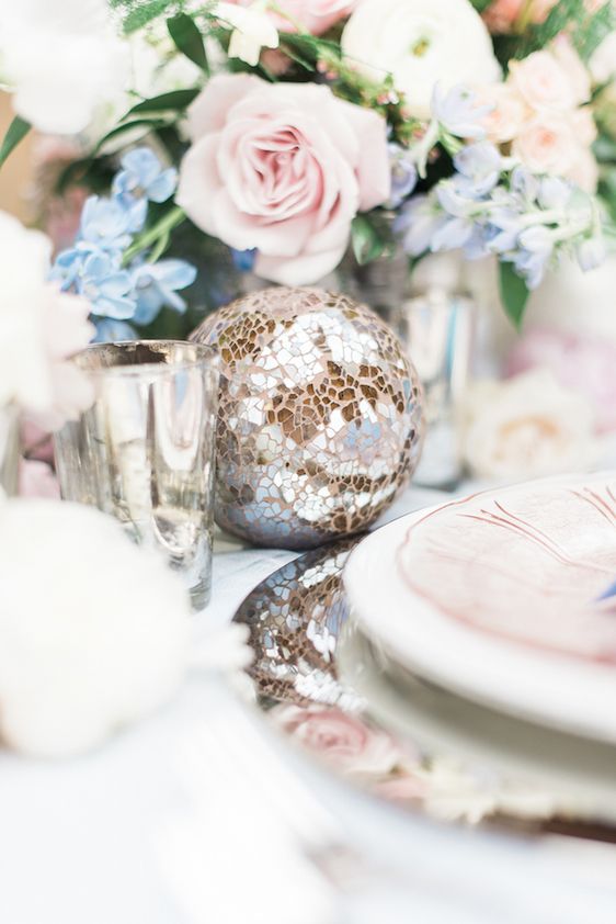
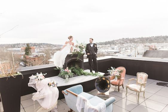
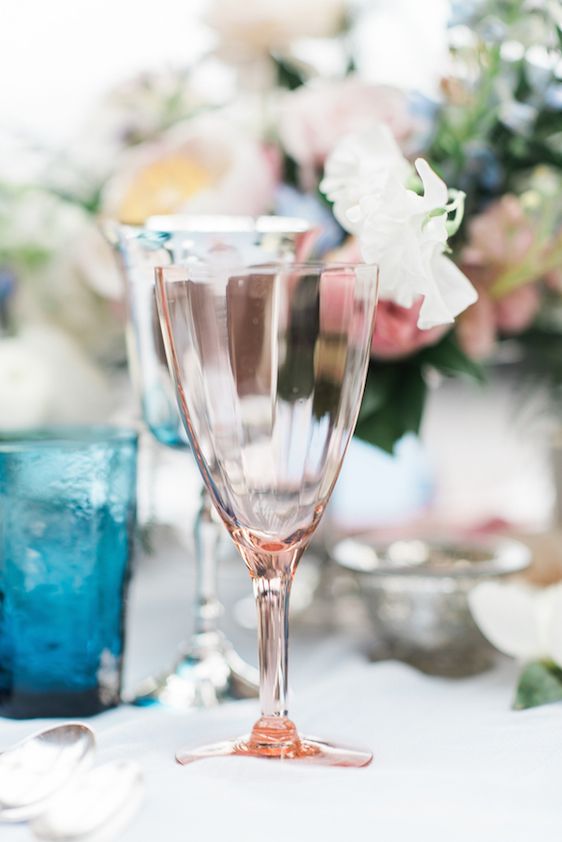
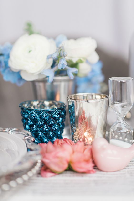
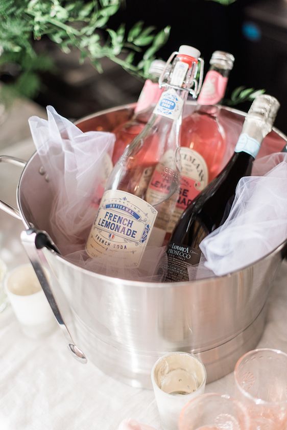
Candlelight really added to the romance of it all...
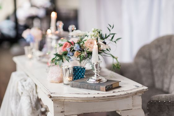
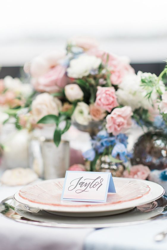
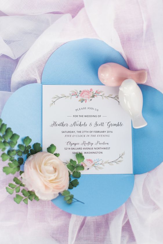
...while a custom stationery suite was designed to coordinate by Noteworthy Ink!
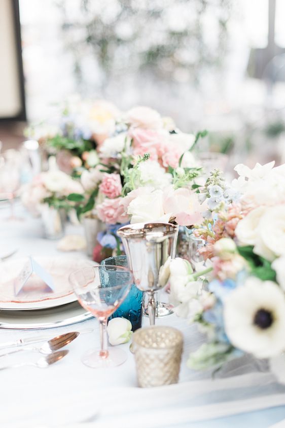
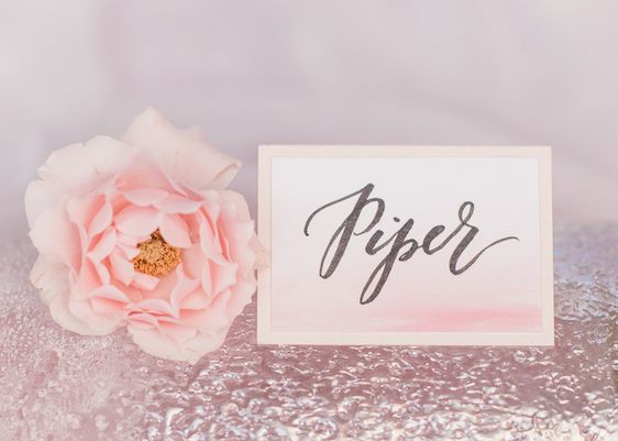
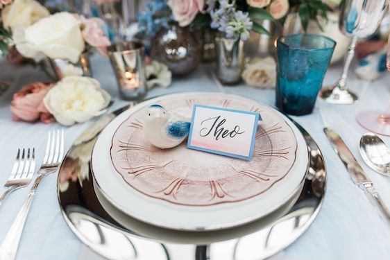
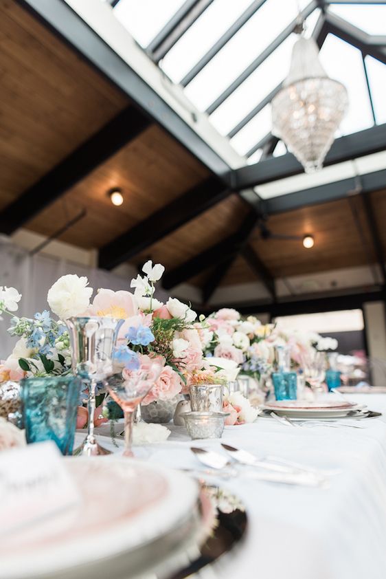
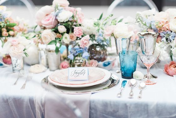
I'm really loving how the place cards are tying into this gorgeous tabletop design...
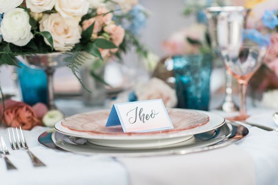
... it's this soft watercolor effect that really stands out and gives these place settings something special.
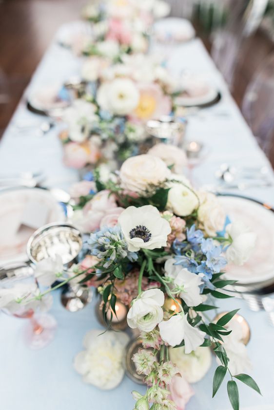
Bunches of anemones add a playful touch to the overall design...
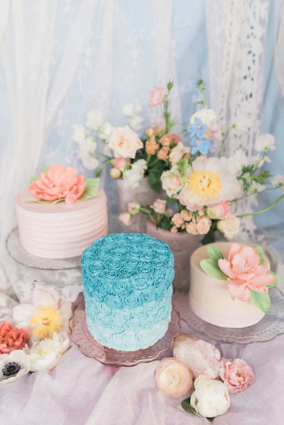
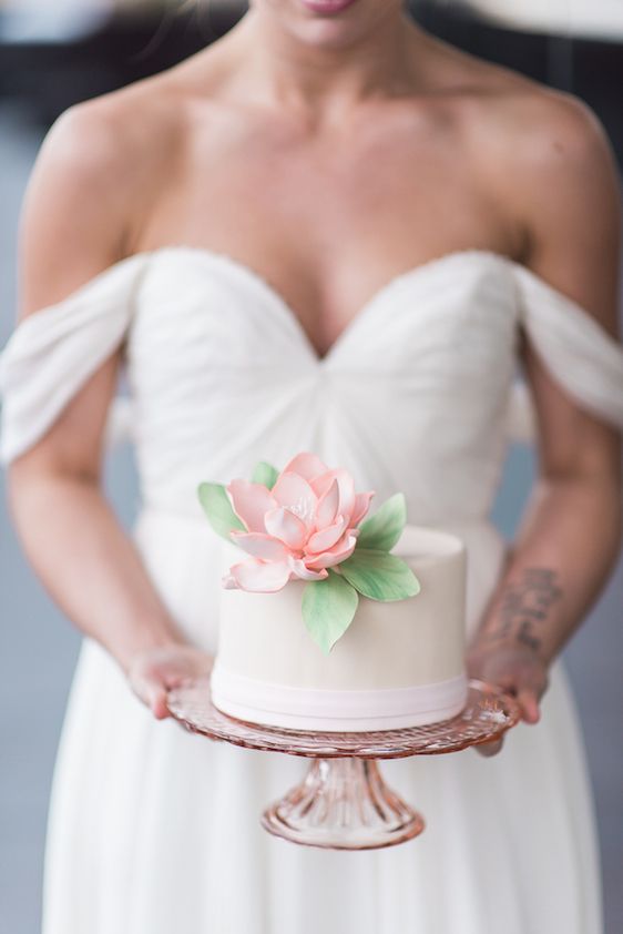
...a playfulness that can also be seen here in this dessert display by BAKED Custom Cakes!
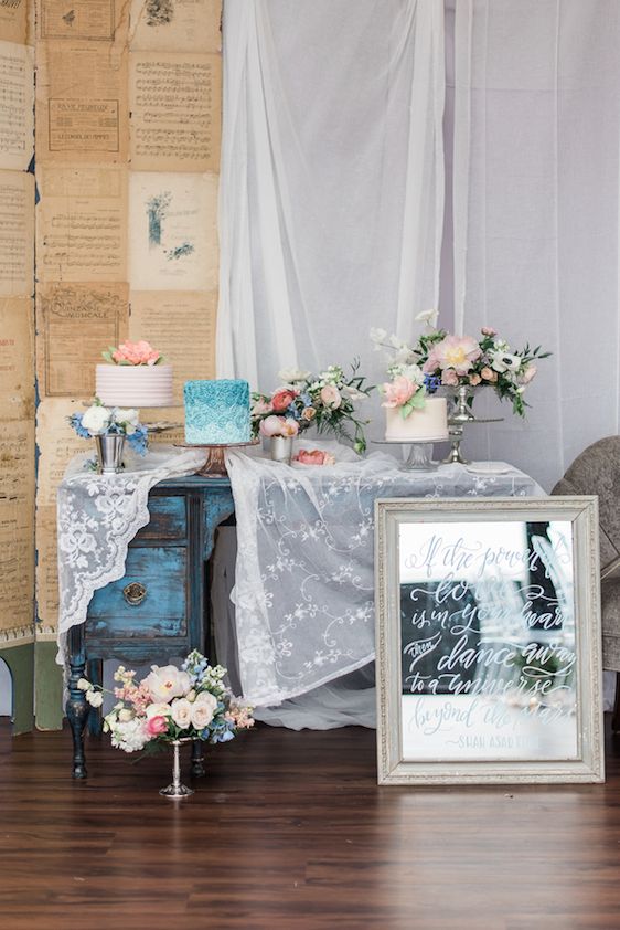
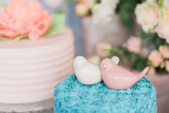
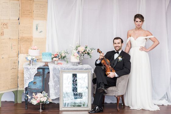
A variety of simple cakes were whipped to compliment the color palette...
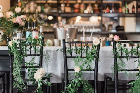
And can we just talk about how gorgeous this ceremony setup is?
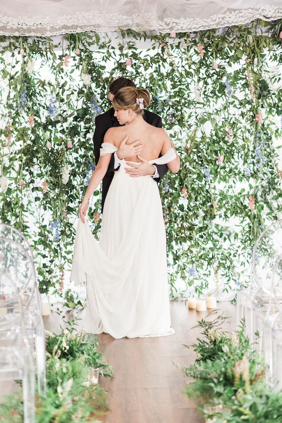
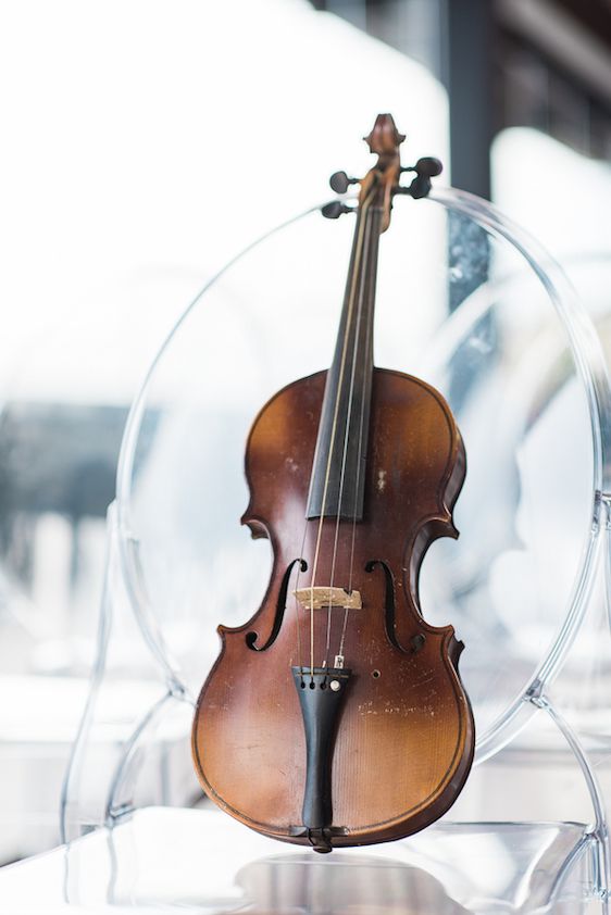
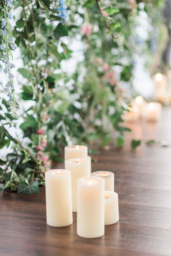
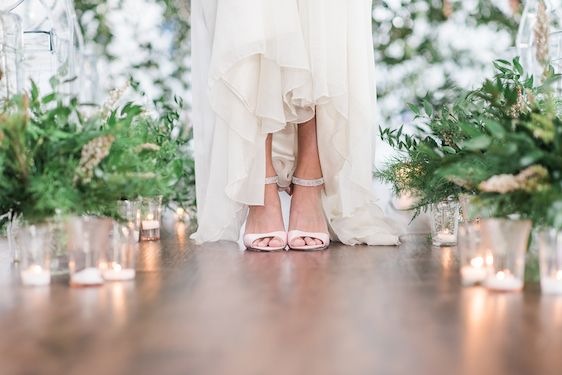
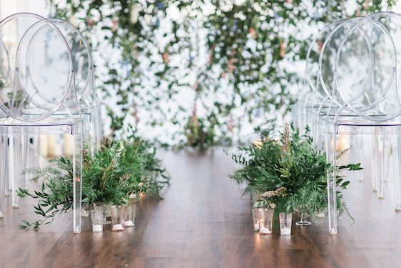
Candlelight, ghost chairs, and greenery! Oh my!
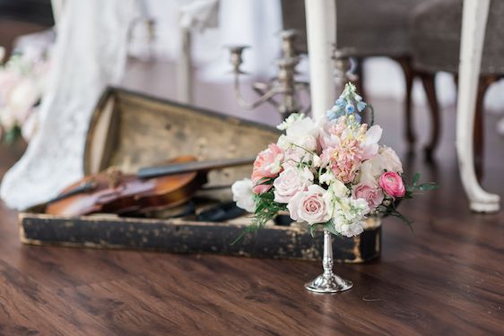
Oh, and twinkly lights? Yes, please!
Huge hugs and high fives to these fabulous West Coast wedding pros! There was beauty to be discovered around each and every corner and it's easy to see that so much heart went into bringing this vision to life!
Becca of B. Jones Photography truly breathed life into the whole shoot with the way she effortlessly directed and captured the models, and there's no denying the beauty that was created by Bright & Co. Such a labor of love and the result? Something straight out of a dream, really!
Plus can we just talk about how beautiful these colors are together? Pantone's Rose Quartz and Serenity are sure to make waves this year in the world of weddings and so it's truly exciting to see this fresh take on the combination!
Photography: B. Jones Photography // Event Planning: Bright & Co. // Design + Decor: Silk & Willow // Floral Designer: Gather // Bakery: BAKED Custom Cakes // Calligraphy: Cable Car Couture // Jewelry: Green Lake Jewelry Works // Culinary: Heritage Distilling // Invitation Designer: Noteworthy Ink // Event Venue: OlympicRooftop Pavillion // Dress Store: The Dress Theory - Seattle // Jewelry: The Mrs. Box // Makeup: Yessi Libby Makeup and Hair // Rentals: Vintage Ambiance // Rentals: CORT Party Rental // Rentals: Fanciful Rentals
From the designer, "When I first laid eyes upon “Serenity” and “Rose Quartz”, the dual Pantone Color of the Year for 2016, what immediately struck me was the soft, dreamy, and playful nature of both colors and how they complemented each other so beautifully.
And so with this romantic theme in mind, this dream team of West Coast event pros made wedding magic happen! Amy of Gather was able to encapsulate motion in her floaty, hanging, and free moving florals....

More from the designer, "Being a dancer myself I was immediately reminded of that same airy nature in ballet..."


"...I wanted there to be a sense of fluidity and movement in everything for this shoot..."

"... and the classically modern backdrop of the Olympic Rooftop Pavillion provided a perfect canvas to bring that vision to life..."


Their breezy open air patio gave the Sarah Seven gown from The Dress Theory the most ideal flowy and fluttery feel....


...while the highlight of this shoot definitely has to be the fact that their beautiful bride just so happened to be trained in ballet and brought along her pointe shoes to play!

More from the design team, "Having the opportunity to watch her move in her gown was a thing of beauty..."


"...and it brought the perfect amount of elegance and weightlessness to an already dreamy scene."

Vintage inspired ring boxes by The Mrs. Box added the prettiest pops of color...

Oh, and can we just talk about these gorgeous silk ribbons by Silk & Willow?


Calligraphy by Cable Car Couture added an unexpected romantic touch...


...and this dreamy, blush sparkler from Green Lake Jewelry Works? love, love, love!

Romantic and all kinds of sweet — such a lovely example of dreamy done right!


Such a twirl-worthy gown and just look at this gorgeous capture!


Candlelight really added to the romance of it all...


...while a custom stationery suite was designed to coordinate by Noteworthy Ink!


I'm really loving how the place cards are tying into this gorgeous tabletop design...

... it's this soft watercolor effect that really stands out and gives these place settings something special.

Bunches of anemones add a playful touch to the overall design...


...a playfulness that can also be seen here in this dessert display by BAKED Custom Cakes!


A variety of simple cakes were whipped to compliment the color palette...

And can we just talk about how gorgeous this ceremony setup is?


Candlelight, ghost chairs, and greenery! Oh my!


Oh, and twinkly lights? Yes, please!


Huge hugs and high fives to these fabulous West Coast wedding pros! There was beauty to be discovered around each and every corner and it's easy to see that so much heart went into bringing this vision to life!
Becca of B. Jones Photography truly breathed life into the whole shoot with the way she effortlessly directed and captured the models, and there's no denying the beauty that was created by Bright & Co. Such a labor of love and the result? Something straight out of a dream, really!
Plus can we just talk about how beautiful these colors are together? Pantone's Rose Quartz and Serenity are sure to make waves this year in the world of weddings and so it's truly exciting to see this fresh take on the combination!


Social Links: